Free · in-browser · no upload

How to Convert a Photo to Halftone

Mono, Spot or CMYK Colour Dot · Square · Diamond · Cross Screen Angle 0–90° Colour Saturation Dot Gain · Gamma 4 Paper Tones Desktop zoom loupe

Reproduce the classic newspaper dot-screen printing process on any photo. Halftone breaks the image into dots, larger ones for darker areas and smaller ones for lighter, so the eye reads continuous tone from pure ink on paper. Keep it to a single black ink, or switch to CMYK colour for the comic-book and pop-art look. Every control is explained below, with tips for a convincing result.

Open Halftone Converter

Photo to halftone: colour and black-and-white, before and after

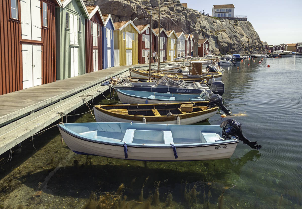
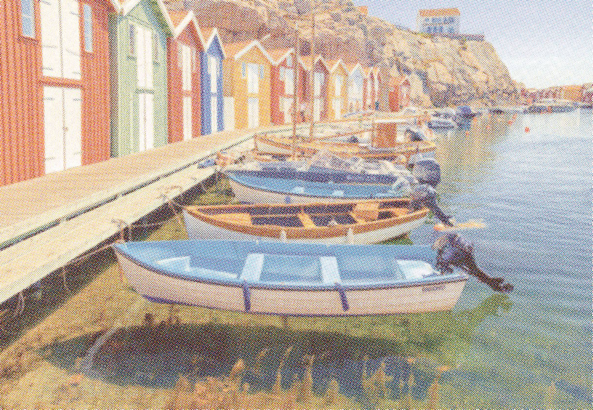
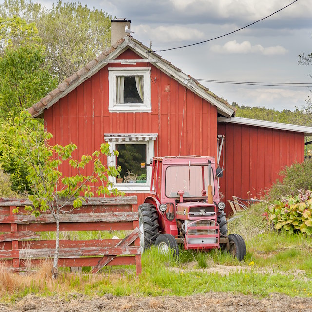
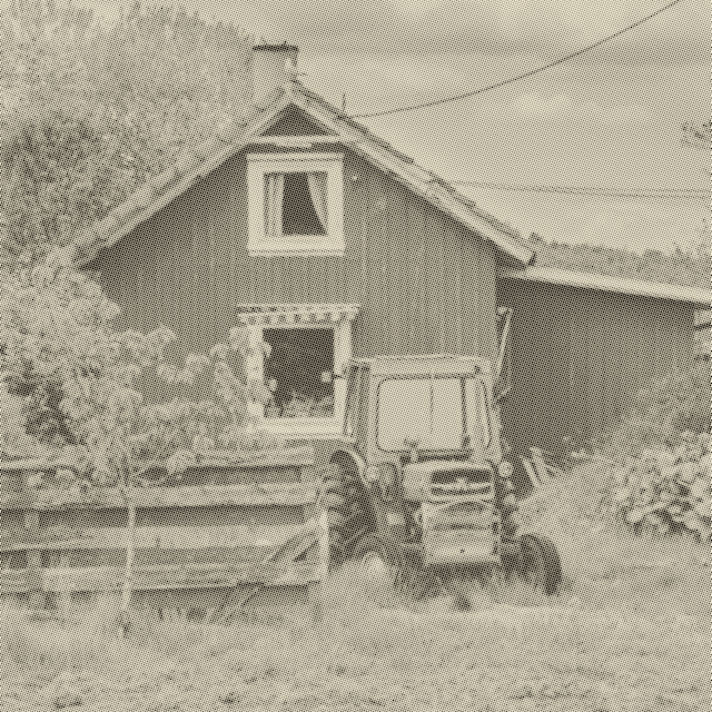
The first example is a CMYK colour halftone: four ink screens (cyan, magenta, yellow and black) overlapped into a dot rosette. With the right settings you may be able to land on your own version of the Ben Day comic-book style. The second is a single black-ink newspaper screen. Both were made from the original photo entirely in the browser, with no upload.

Original colour photo of a harbour with brightly painted wooden fishing sheds and moored boats, before the halftone effect
Before
The same harbour photo converted to a CMYK colour halftone with a visible cyan, magenta, yellow and black dot rosette
CMYK colour halftone
Original photo of a red house, before the halftone effect
Before
The same red house photo converted to a monochrome newspaper halftone dot screen
Monochrome halftone

Start with the dot size

Dot size is the master control. It sets how coarse or fine the screen is, and everything else is adjusted around it. Set it first, then match it to how the image will be seen: bigger dots for large prints viewed from a distance, smaller dots for anything shown on a screen or held close.

Dot sizeLookGood for
2 px Fine screen that still reads clearly as a photograph. On a screen, small images, a magazine feel.
3 to 4 px Dots visible up close, but the picture still holds together. The classic newspaper photo look.
6 px (default) Dots read plainly as dots at normal viewing distance. Comic book and vintage newspaper.
8 to 12 px Big, bold dots. Little fine tonal detail survives. Pop art, posters, the dot pattern as the subject.
14 to 20 px Very large dots, tone reduced to a few steps. Graphic statements, close Lichtenstein style.

If the result looks muddy, that is almost always contrast, not dot size. Raise contrast so the midtones separate into clearly different dot sizes, then judge the grid. Screen ruling below relates these pixel sizes to the LPI numbers used in real printing.

Open Halftone Converter

How to convert a photo to halftone

A convincing halftone is mostly about matching the dot size to how the image will be seen, then giving the converter enough contrast to separate tones into distinct dots:

1
Upload a photo
Drag and drop it onto the screen or click to select a file (JPG, PNG, GIF, WEBP). Images with a clear subject and bold highlights and shadows reproduce best. Halftone throws away subtle mid-tone detail, so a flat, low-contrast photo tends to turn to mush.
2
Set the dot size first
This is the master control, effectively the screen resolution. Large dots (12 to 20 px) give a bold poster or comic look; small dots (2 to 6 px) give fine newsprint that still reads as a photograph. Match it to display size: coarse dots for large prints and banners, fine dots for anything viewed on screen or up close.
3
Set the screen angle
Leave it at 45° for the authentic newspaper look, where the diagonal grid is least visible to the eye at reading distance. Use 0° or 90° for a deliberate, structured grid or op-art effect. 15° and 75° are the traditional angles used for individual CMYK separations if you want to fake colour-registration artefacts.
4
Tune contrast and brightness
Push contrast up until the midtones split into clearly different dot sizes. That separation is what makes a halftone read as tone rather than grey noise. If the result goes dark and clogged, raise brightness a little. Adjust these before you judge the dots; they change the whole character of the screen. Gamma sits beside them: it bends the midtones while leaving black and white fixed, so above 1 opens the shadows and below 1 deepens them.
5
Choose monochrome, spot colour or CMYK
Leave Colour Mode on Monochrome for a single black-ink newspaper screen. Pick Spot Colour for that same single ink screen in a colour you choose. Switch to CMYK Colour to split the photo into cyan, magenta, yellow and black separations, each screened at its own traditional angle and overlapped the way a four-colour press works. The overlapping dot grids build into a rosette, and with some tuning you may get close to your own version of the Ben Day screen behind classic colour comics and pop art. In colour mode a Colour Saturation slider appears: drop it toward zero for a faded, poorly-registered vintage press, push it past 100% for punchy Sunday-comics colour.
6
Choose dot shape, paper tone and dithering
Circle with Newsprint is the classic magazine and newspaper combination. Square reads as coarse and digital, Diamond as sharp and editorial, Cross as an open engraved texture. The dot shape only really shows at a large dot size: at small sizes every shape is a few pixels and looks much the same, so turn the dot size up to compare them. Leave pre-screen dither on None for a pure screen; add Floyd-Steinberg or Atkinson to break up banding in skies and gradients; use a Bayer setting for a visible retro ordered-dither texture under the dots. (Pre-screen dither applies to monochrome mode.)
7
Check the dots up close, then save
On a desktop browser, move your mouse over the preview to open the detail loupe: a magnified crop of the plate, with Wide, Mid and Close zoom levels, that keeps updating as you adjust the controls, so you can see exactly how dot shape, size and angle land at the dot level. When it looks right, press Save Plate to download the full-resolution PNG straight to your device. Reset restores every control to its default so you can start again.

Everything above happens entirely inside your browser. There is no upload, no server processing and no account. Your photo never leaves your device.

Open Halftone Converter

What each control does

ControlRange / optionsWhat it does
Colour mode Monochrome · Spot Colour · CMYK Colour Monochrome screens the image as one black ink, the newspaper default. Spot Colour does the same in an ink colour you choose. CMYK Colour separates it into cyan, magenta, yellow and black dot grids at the traditional angles (roughly 15°, 75°, 0° and 45°) and overlaps them like a four-colour press, for the colour comic-book and pop-art look.
Ink colour Any colour (Spot Colour mode only) The single ink the dots print in. Everything else behaves as in Monochrome. Only shown when Colour Mode is set to Spot Colour.
Colour saturation 0% to 200% (CMYK mode only) Below 100% the colour fades toward a near-monochrome, washed-out vintage print; above 100% the inks get bold and poster-bright. Only shown when Colour Mode is set to CMYK Colour.
Dot size (grid) 2 to 20 px Scales the halftone screen frequency. Larger dots look coarser and more graphic; smaller dots hold finer tonal detail. The single most important setting.
Dot gain (fill) 100% to 260% Fattens every dot so the screen fills in darker and inkier. 100% is neutral. Raise it to swell the dots together toward solid coverage while the highlights stay open.
Contrast 50% to 200% Adjusts the source image before screening. Higher contrast simplifies the tonal range into bolder, more distinct dots.
Brightness 50% to 200% Lifts or lowers the source. Use it to rescue shadow areas that clog into solid ink, or to thin out an image that screens too light.
Gamma 0.30 to 2.50 Reshapes the midtones before screening, leaving black and white fixed. Above 1 opens the shadows and midtones; below 1 deepens them. Sits beside Brightness.
Screen angle 0 to 90° Rotates the dot grid. 45° is the classic newspaper angle; 0° and 90° give a structured grid; 15° and 75° are traditional CMYK separation angles.
Dot shape Circle · Square · Diamond · Cross Circle (classic newspaper), Square (blocky and graphic), Diamond (angular and sharp), Cross (open lattice, screen-print structure). The shape only shows clearly at a large dot size — at small sizes every shape is only a few pixels and looks the same.
Paper tone White · Newsprint · Aged Yellow · Sepia Sets the background colour the dots print on and the ink tint. See the table below.
Pre-screen dither None · Floyd-Steinberg · Atkinson · Bayer 2×2 / 4×4 / 8×8 · Burkes · Stucki · Random Noise Optional dithering pass applied before the halftone screen. Smooths gradients or adds retro texture. Applies in monochrome mode.
Detail loupe (desktop) Wide · Mid · Close Hover the preview with a mouse to open a magnified crop of the plate. It updates as you change controls, so you can see exactly how dot shape, size and angle affect the dots up close.

Paper tones

ToneSwatchCharacter
White Clean and modern.
Newsprint A period newspaper.
Aged Yellow Old sun-faded stock.
Sepia A vintage photo print.
Open Halftone Converter

Tips for a convincing halftone

Conversion examples

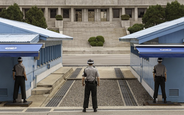
Original landscape photo, before the halftone effect
Before
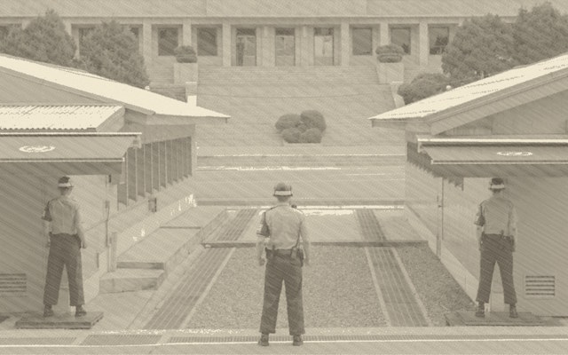
The same landscape converted to a halftone newsprint dot screen
Halftone converted
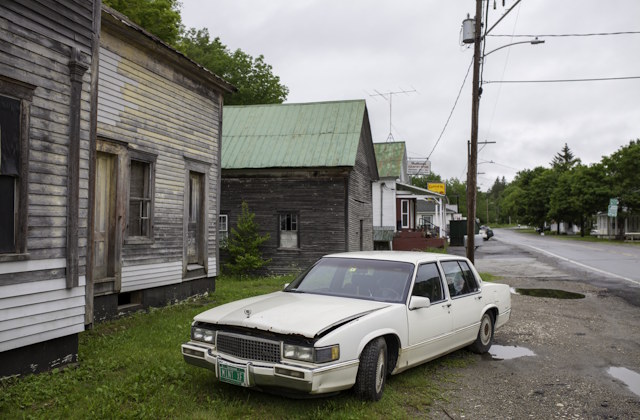
Original photo of a car, before the halftone effect
Before
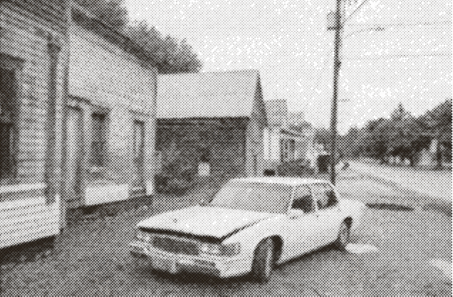
The same car photo converted to a white-paper halftone dot screen
Halftone converted
Open Halftone Converter

How halftone printing works

Traditional printing can only put ink down or leave paper bare. There is no grey, only black dots on white paper. Halftone solves this by varying the size of dots rather than their colour. A dark area is covered with large dots that run nearly edge to edge; a light area has tiny dots with wide gaps between them. Viewed at reading distance, your eye averages the ink coverage and perceives a continuous tonal gradient.

Newspapers used a physical halftone screen, a glass plate with a grid of holes, placed between the photograph and the film during photographic reproduction. The screen broke the continuous-tone image into a grid of dots scaled by light intensity. Modern digital halftone does the same calculation in software, sampling each cell of the screen and placing a dot proportional to the average darkness of that cell.

The screen angle matters because rotating the dot grid by 45° makes the pattern much less visible to the eye at normal reading distance. At 0° the grid structure is obvious; at 45° the diagonal arrangement breaks up the regularity just enough that the dots read as tone rather than pattern.

Colour printing extends the same idea to four inks. The image is separated into cyan, magenta, yellow and black, and each ink gets its own halftone screen rotated to a different angle so the grids do not collide into a moiré. Where the four screens overlap they form a small flower-like pattern called a rosette, and the eye mixes the four inks into full colour. That is what CMYK Colour mode reproduces, and turning the screens slightly out of register is exactly what gives old comics and newsprint colour their characteristic fringed, hand-printed feel.

Try it yourself →

Screen ruling: dot size in printing terms

In real printing, the fineness of a halftone is called the screen ruling, measured in lines per inch (LPI). A low LPI means bigger, more visible dots; a high LPI holds more tone but needs better paper and presswork. These are the rulings the trade has settled on:

Print typeScreen rulingWhy
Newspaper 85 LPI (65 to 100) Coarse on purpose. Absorbent newsprint and fast presses spread the ink.
Magazine, commercial offset 133 to 150 LPI The everyday good quality standard.
Art books, coated stock 175 to 300 LPI Fine enough that the dots vanish at reading distance.
Screen printing 35 to 65 LPI Limited by what the mesh can resolve.
Pop art, Ben Day comics 20 to 60 LPI The dots are meant to be seen.

This converter measures Dot size in screen pixels, not LPI. Viewed at about 300 DPI the two line up roughly like this:

Dot sizeRough equivalentReference
2 px150 LPIMagazine quality
3 px100 LPICoarse newspaper
4 px75 LPIOlder, cheaper newsprint
6 px50 LPIComic book, vintage newspaper
8 to 12 px25 to 38 LPIPop art
Open Halftone Converter

Common questions

Is the halftone converter free?

Yes. It is completely free, with no account, no sign-up and no watermark on the exported PNG.

Are my photos uploaded anywhere?

No. All processing happens in your browser using an HTML5 canvas. Your image never leaves your device and nothing is sent to a server.

What dot size should I use?

Set the dot size first and match it to how the image will be seen: bigger dots for large prints viewed from a distance, smaller dots for anything shown on a screen or held close. As a rough guide at 300 DPI, 3 to 4 px reads like a real newspaper photo, 6 px is the default comic book and vintage newspaper look, and 8 px and up is pop art where the dots are the point. The dot size table and screen ruling table lay this out in full.

Can I get a comic book or pop-art dot look?

Yes. Use a large dot size, push contrast up, pick the circle or square dot shape and set the paper tone to white for a bold Lichtenstein-style result. For the colour comic-book look, switch Colour Mode to CMYK Colour so the image is screened as overlapping cyan, magenta, yellow and black dot grids, then raise Colour Saturation for bright Sunday-comics colour. With some experimenting you may land on your own version of a Ben Day screen.

Why does my converted image look muddy?

Usually the source contrast is too low, or the dot size is too small for the amount of detail. Raise contrast so the midtones separate, and increase the dot size so each dot has room to grow and shrink.

What is the difference between halftone and dithering?

Halftone varies the size of dots on a fixed grid. Dithering scatters same-size dots at varying density. The pre-screen dither option lets you combine both: dither first, then screen the result into halftone dots.

Open Halftone Converter